


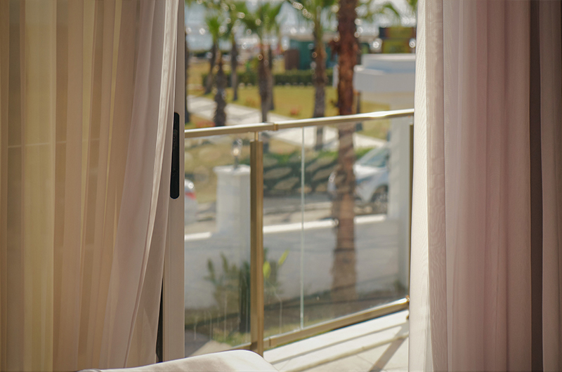
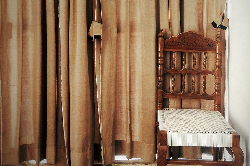
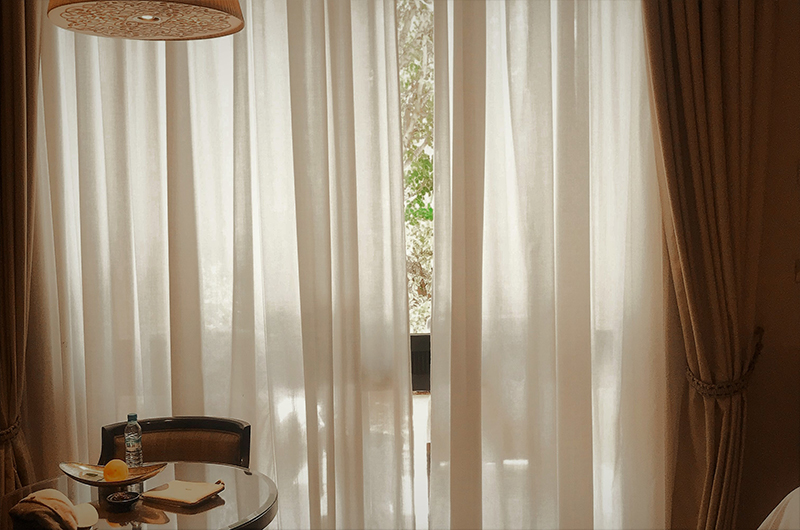
Curtains in a home setting provide not only comfort but also functionality, which is a double benefit. Drapes shield the property from a variety of elements, including direct sunshine, dust, the glow of nearby city lights at night, the movement of hot and cold air, and more. As a result, you need to use responsible decision while selecting curtains. The color of the window coverings, as a component of the overall atmosphere of the room, reflects your sense of taste. Changing the color of the curtains may bring about a dramatic shift in the ambiance of the space. Let’s have a look at some design ideas and get some expert advice on how to choose curtains that will look well in the living room, bedroom, kitchen, or nursery when you find yourself in a situation where there are too many options to choose from.
Gradients of color
When it comes to selecting colors for curtains, there are two primary ways to consider. The first strategy is to choose a color for the curtains that is part of the same color scheme as the primary palette for the interior. The color combination of the curtains, on the other hand, should not be the same as the color of the wallpaper. It is recommended that the cloth be either a little brighter or a little darker than the walls.
If you want to paint a room in beige tones, for instance, the drapes you choose for the space may be ivory or cream.
High-Contrast colors
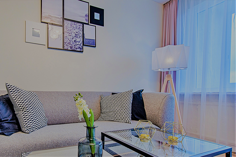
Contrasting colors are the second option to consider when selecting the color of the curtains. This strategy results in a combination that is eye-catching, daring, and very expressive. Dealing with pure hues, such as white and black, gray and red, purple and green, is the least difficult option. Take into consideration the function of the place as well as the aesthetic you want to achieve inside of it, as the completed image can seem hostile.
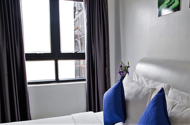
Ivory and chocolate are two instances of contrasting colors that seem more subdued when used together in a palette that has been muted. Even when working with a pastel color palette, it is possible to design interiors that are both delicate and expressive thanks to the use of contrast.
Synchronization of curtains and furnishings
When choosing window coverings, it is important to take into mind not only the color of the walls but also the color of the furniture in the room. In this particular circumstance, what choices do we have? The first option is to use drapes and wallpaper of a like tone, but choose a material for the upholstery that stands out. For instance, olive drapes, pistachio walls, and burgundy brown furniture would be a nice combination. The second possible alternative is to contrast the decorating of the space with the color of the drapes by matching them to the tone of the furniture
Curtains and also other interior items
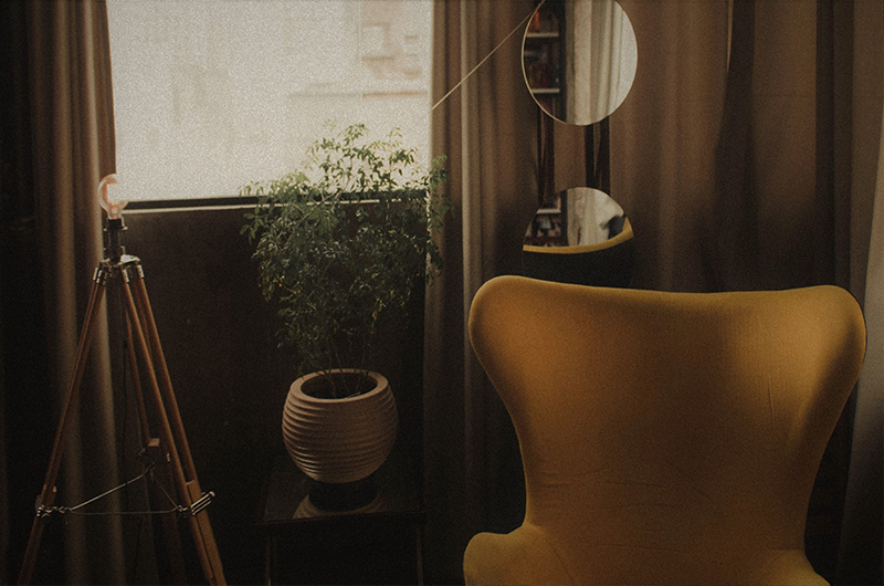
Compatibility of window coverings with other fabrics used in the house, such as ornamental cushions, bedspreads, napkins, and tablecloths, is considered to be one of the most fundamental criteria of interior harmony. This is a really intriguing design solution that is used seldom, and it involves sewing ornamental fabrics and curtains out of the same cloth.
It is not necessary to find a precise match; it is sufficient to just produce harmony in the palette. On the other hand, if the textiles contain designs, the curtains have to have patterns that are comparable to them.
Overall design and the colors of the curtains
The characteristics of the interior design style have a role in the selection of the color for the curtains, as well. As an example, the minimalist style makes active use of the traditional color trio composed of black, white, and red. Pink flowery curtains are not likely to work well with this kind of design, and burgundy tones are most likely not acceptable for eco-style; nonetheless, they would look fantastic in a living room decorated in Victorian style.
Texture
The feel of a cloth may have an effect on how different colors and tones are perceived by the viewer. The color seems to be more vibrant, and even more so at times, when the cloth has a higher density. Glossy and silky textures also contribute to an increase in value and brightness. However, curtains with a sheer light make even the most saturated colors seem to have no substance.
Take into consideration the psychological effects of color. The décor of a wedding couple’s bedroom might benefit from the use of the trendy colors red and black. Since the use of gentle pastel hues would provide a soothing ambiance at a workplace, it is doubtful that an office would benefit from their application. A bedroom painted in a cheery orange hue will make it difficult to wind down and relax. A living room could seem more festive if it has white curtains, but the space might feel less warm as a result.
There are many color schemes designed specifically for each area, such as blue for the bedroom, green for the study, and so on. However, this does not imply that you are required to choose curtains in accordance with this guideline. After all, the most essential factor to consider is the singularity and individuality of your preferences.
You can find many models of curtains on Ikea and you can order them online. On Ikea you can find curtains of any style and material, with a wide range of features to choose from.


